reimagining a legacy system into a modern web based interface
The team was charged with re-designing a legacy Java tool by engaging with a community of users to gather feedback and insights.
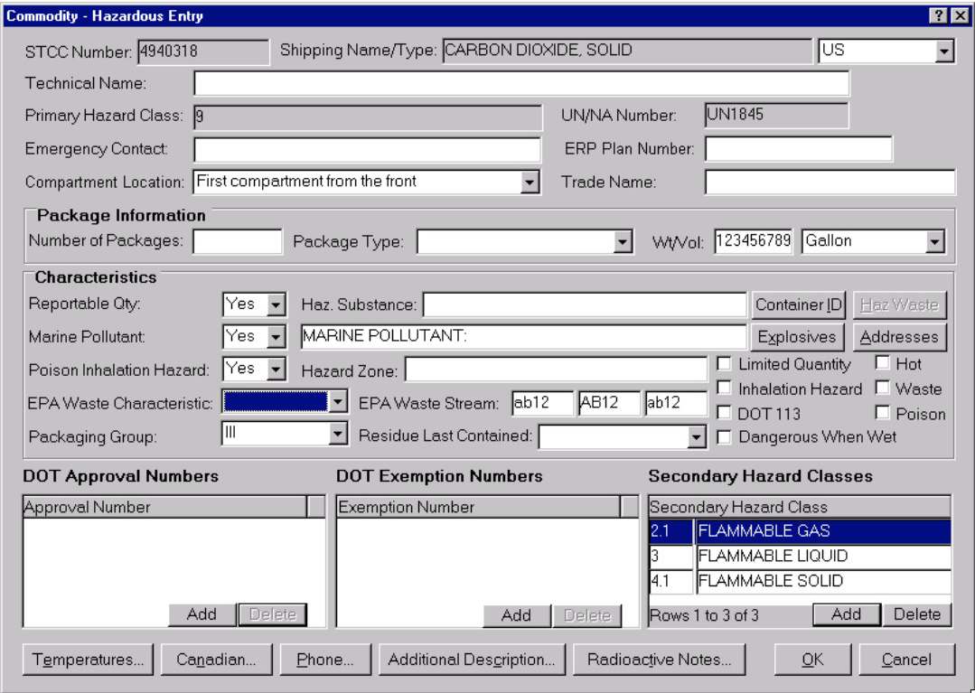
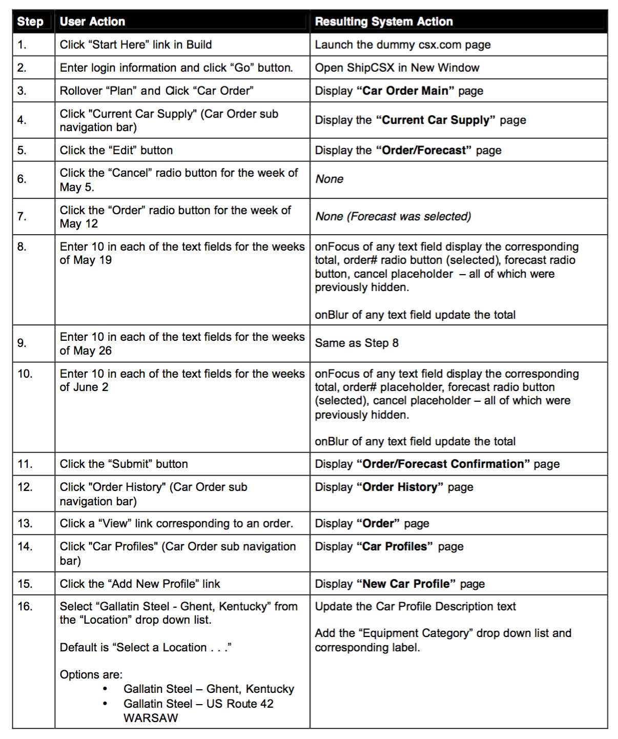
Example of existing interface.
For each critical flow, we had about a dozen different variations that we had to iterate down to one flow that meet all of our users needs.
For each step in the critical flows, we developed detailed yet lo-fidelity wireframes. These wireframes allowed use to validate the data fields, inputs and outputs against the business case. It's important to note; We were provided with a detailed style guide. This style guide would determine the visual elements on each page. This included but was not limited to: Table headers, navigation elements, buttons, input fields, logos and error messages.
So far we have been working in two parallel tracks. The user flows and wireframes have been refined down and an interactive prototype has been built. At the same time, we have developed a usability testing plan, and a usability evaluation plan. We are going to start testing with about 10 customers. These tests are conducted online at the users place of work with one team member on hand to conduct the test and observe the activity. We are also conducting an online survey for the participants to fill out after there test.
Example Test Pocedure.
So.. we have completed testing, received the surveys and compiled the results into a set of recommendations. Theres lots to work on, but for the most part they are just tweeks. We have however uncovered an opportunity, and it's a big one.
It becomes clear throughout the testing that most users are doing the same thing every time they log in. We have allowed for it with car profiles, but that only addresses one variable. It turns out, we have the potential to create templates that could potentially eliminate all errors for those users. This is a key sucess metric.
The question becomes. We are day 64 or 87, about to deliver the final set of designs and we feel this new functionality is a game changer. It means a change to the data model, the app logic, and the interface, so we debate how are we going to sell this into the wider team.
We devise the "Quick Ship" brand for the idea.
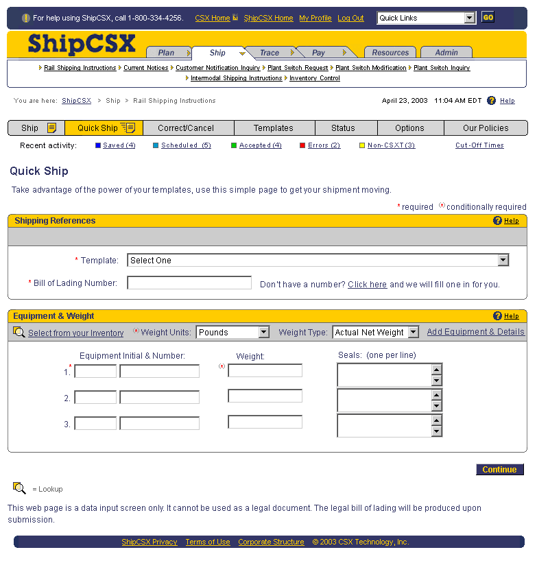
The image encapsulates the intent beautifully. It's crafted in respect to the style guide but demonstrates very simply how this approach will take even our best current option, which requires 20+ fields, and reduce the input to a potential 0, with a potential zero error rate.
We develop a new prototype to demonstrate how it works and present it to the team.
My Roles: UX Research, User Testing, Critical User Flows, Wireframes, Prototyping.
This project started out like most others. We were handed a business case document that outlined the initiative in fine detail. CSX had discovered through 6Sigma that there were opportunites to improve several areas of operations through an improved user experience for their customers when ordering services.
We digested the business case into a simple list of objectives:
- Reduce downstream costs by improving input data quality via an enhanced interface.
- Reduce downstream costs by automating existing manual BOL-related processes.
- Reduce manual BOL input costs by improving the user experience to increase adoption.
- Reduce system maintenance costs by creating a unified architecture.
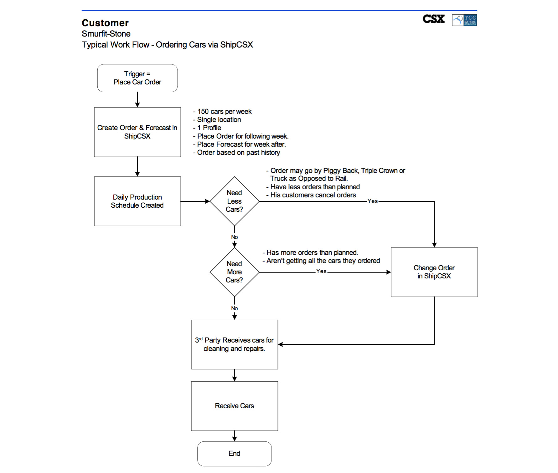
First step was to map out some critical User Flows.
For each critical flow, we had about a dozen different variations that we had to iterate down to one flow that meet all of our users needs.
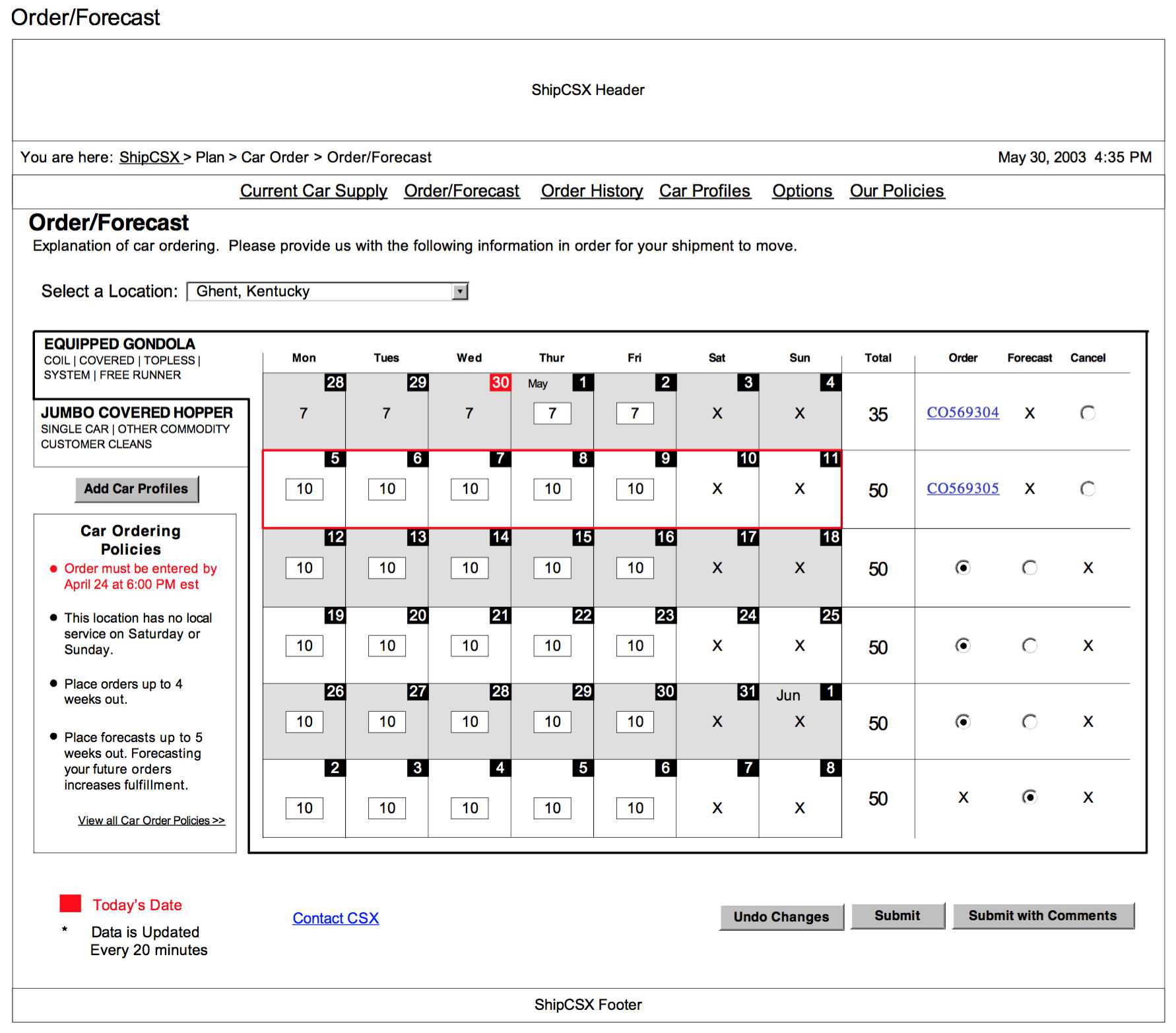
next step was to start laying out lo-fidelity wireframes.
For each step in the critical flows, we developed detailed yet lo-fidelity wireframes. These wireframes allowed use to validate the data fields, inputs and outputs against the business case. It's important to note; We were provided with a detailed style guide. This style guide would determine the visual elements on each page. This included but was not limited to: Table headers, navigation elements, buttons, input fields, logos and error messages.
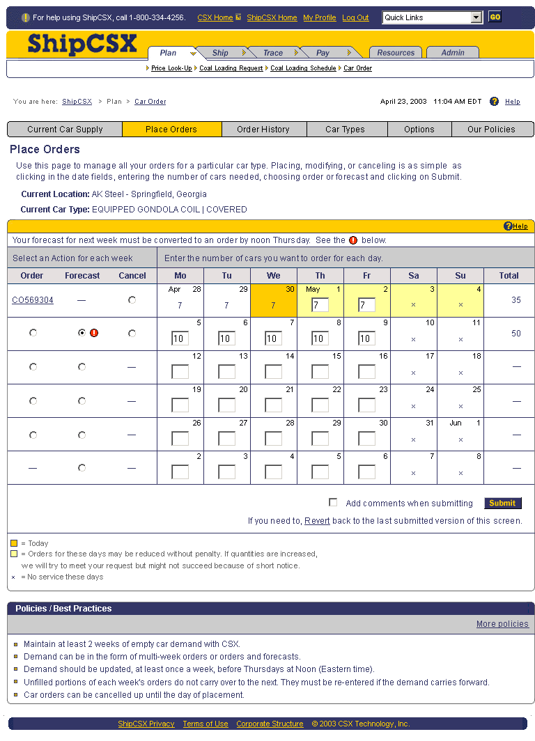
We were provided with a detailed style guide, which would determine the UI as we started developing hi-fidelity wireframes.
It's time to start testing
So far we have been working in two parallel tracks. The user flows and wireframes have been refined down and an interactive prototype has been built. At the same time, we have developed a usability testing plan, and a usability evaluation plan. We are going to start testing with about 10 customers. These tests are conducted online at the users place of work with one team member on hand to conduct the test and observe the activity. We are also conducting an online survey for the participants to fill out after there test.
Example Test Pocedure.
So.. we have completed testing, received the surveys and compiled the results into a set of recommendations. Theres lots to work on, but for the most part they are just tweeks. We have however uncovered an opportunity, and it's a big one.
We've uncovered an opportunity, and it's a big one.
It becomes clear throughout the testing that most users are doing the same thing every time they log in. We have allowed for it with car profiles, but that only addresses one variable. It turns out, we have the potential to create templates that could potentially eliminate all errors for those users. This is a key sucess metric.
The question becomes. We are day 64 or 87, about to deliver the final set of designs and we feel this new functionality is a game changer. It means a change to the data model, the app logic, and the interface, so we debate how are we going to sell this into the wider team.
We devise the "Quick Ship" brand for the idea.
The image encapsulates the intent beautifully. It's crafted in respect to the style guide but demonstrates very simply how this approach will take even our best current option, which requires 20+ fields, and reduce the input to a potential 0, with a potential zero error rate.
We devise the "Quick Ship" brand for the idea.
We develop a new prototype to demonstrate how it works and present it to the team.
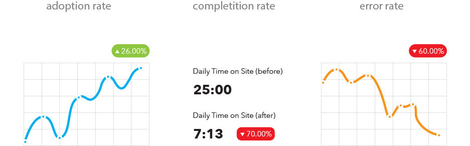
The solution is embraced and quickly integrated with agility into the development teams workflow.
some performance metrics